Transforming higher education event planning
into a seamless, single-source experience
Project Outcomes
System Usability Score up from 30 (poor) to 84 (Excellent)
Replaced spreadsheets entirely across early adopters
Doubled conference module interactions and engagement
Net Promoter Score up from -21 to 65
The Challenge
Our old system forced planners to click through multiple modules, one for function rooms, another for catering, another for group accommodation and yet another for resources, without ever seeing the full picture
The lack of visibility created a broken process:
Decisions were slowed down
Stakeholders couldn’t see what was booked vs. available
Event organisers were left piecing together the story across tabs, tools, and spreadsheets
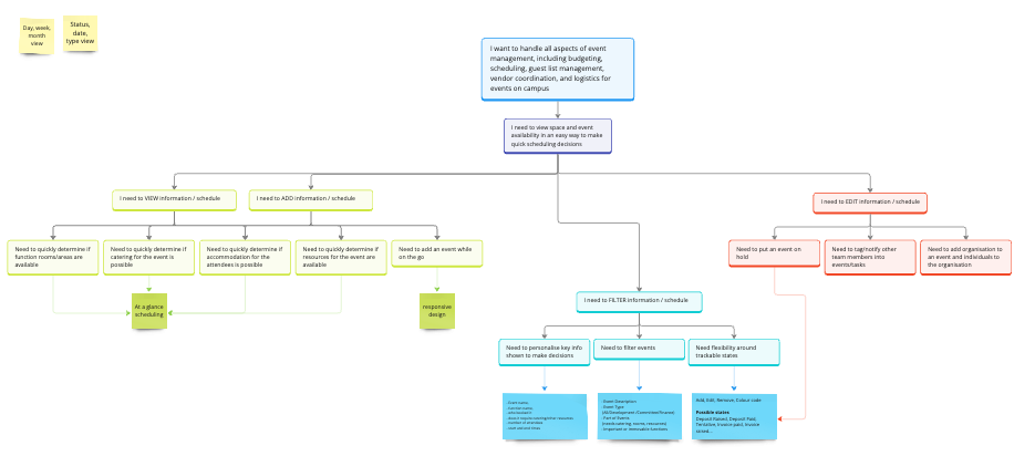
The challenge was clear. How might we create a single holistic view of an event so planners can make confident decisions?
Discovery: Learning from the Experts
I adopted Teresa Torres’ continuous discovery framework, embedding regular conversations with customers into our design process.
Some of the key activities included:
Stakeholder interviews: uncovering pain points with our users and internal SMEs
Opportunity Solution Tree: mapping where we could make the biggest impact
Hypothesis statements: turning user frustrations into testable ideas
I also ran competitor analysis. What I found:
Tools like Outlook and spreadsheets were common
Specialist systems offered multiple views, but not for events in their entirety
This reinforced our differentiator:
A single, integrated planner for Events, Functions, and Groups
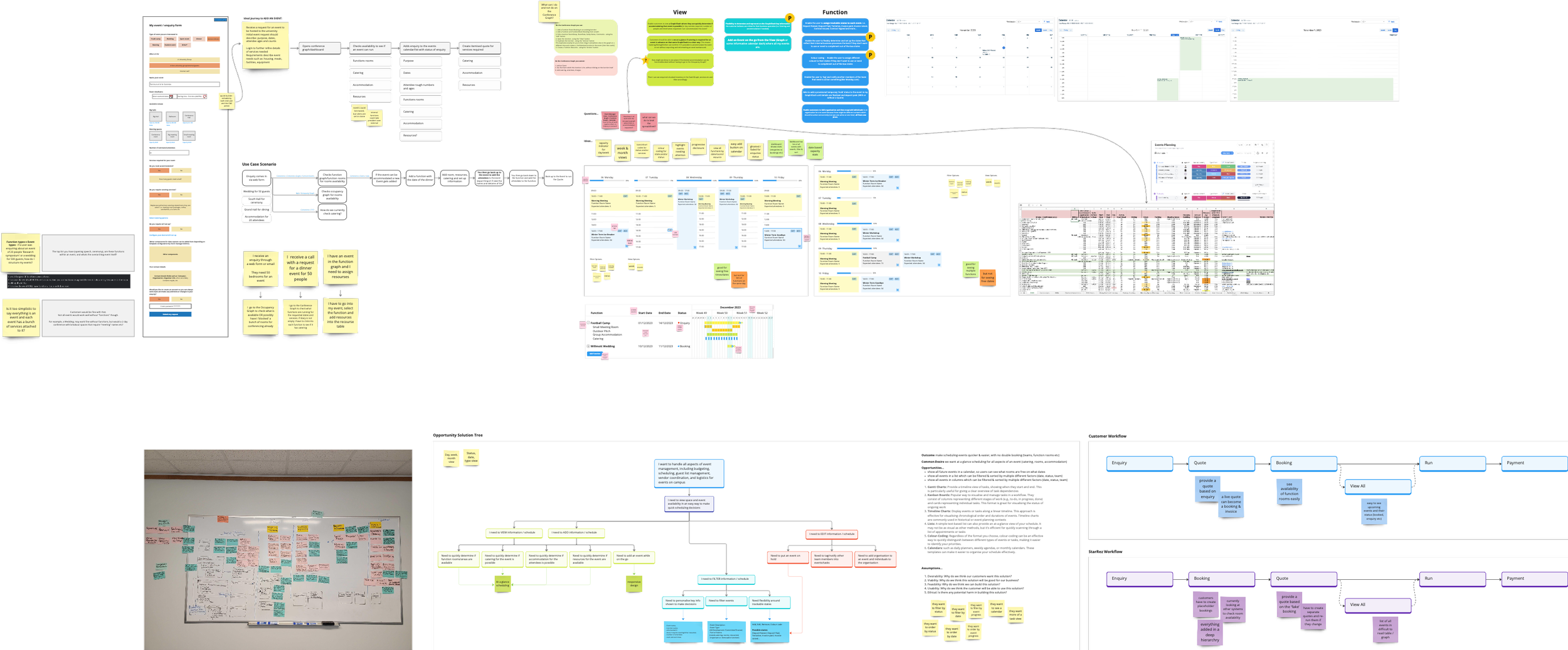
My Design Journey
As the only designer working alongside a product manager and five software engineers, I structured my design process into three key phases:
1. Ideation of Possibilities
Starting with low-fidelity wireframes, exploring different calendar layouts and interaction models.
Sharing these early and often, gathering feedback before investing too heavily
2. Prototyping & Testing
As ideas matured, I built interactive Figma prototypes. These were tested with real users in our Early Adopter Program, revealing quick wins (like colour-coded event statuses) and essential improvements (such as better filtering and category tags)
3. Iterating with Feedback
Our feedback loop was invaluable. I heard things like:
“I just need to see everything in one place, if rooms and catering clash, I want to spot it instantly.”
This insight directly shaped the “single-view” design
The Solution: Conference Planner
The final product was designed as the single source of truth for event planners
Key features included:
Visual Availability View: Instantly see open dates, event durations, and room availability
Integrated Bed & Room Tracking: Combine accommodation with event functions in one interface
Event Notifications: Surface important alerts like “Campus Closed” or “Commencement Day”
Single-View Event Management: No more switching tabs, everything lives in one place
Screens were clean, intuitive, and built for speed. No more endless clicks to get information needed
The Impact
For the users, the Conference Planner meant:
Confidence
Full visibility into bookings and statuses
Efficiency
Reduced manual errors, double bookings, and reliance on Excel
Adoption
A centralised tool designed to be the go-to for Events planning