
Designing technology that worked for everyone
even those who didn’t want to use it
Project Outcomes
This project reminded me what human-centred design really looks like, not just personas and prototypes, but empathy, patience, and respect for how people actually work
The biggest win wasn’t the interface. It was the moment a patrol who once refused to use the app said, “I can actually use this now
The Challenge
The existing tools were clunky, text-heavy, and unadaptable, designed around process, not people. Patrols needed to:
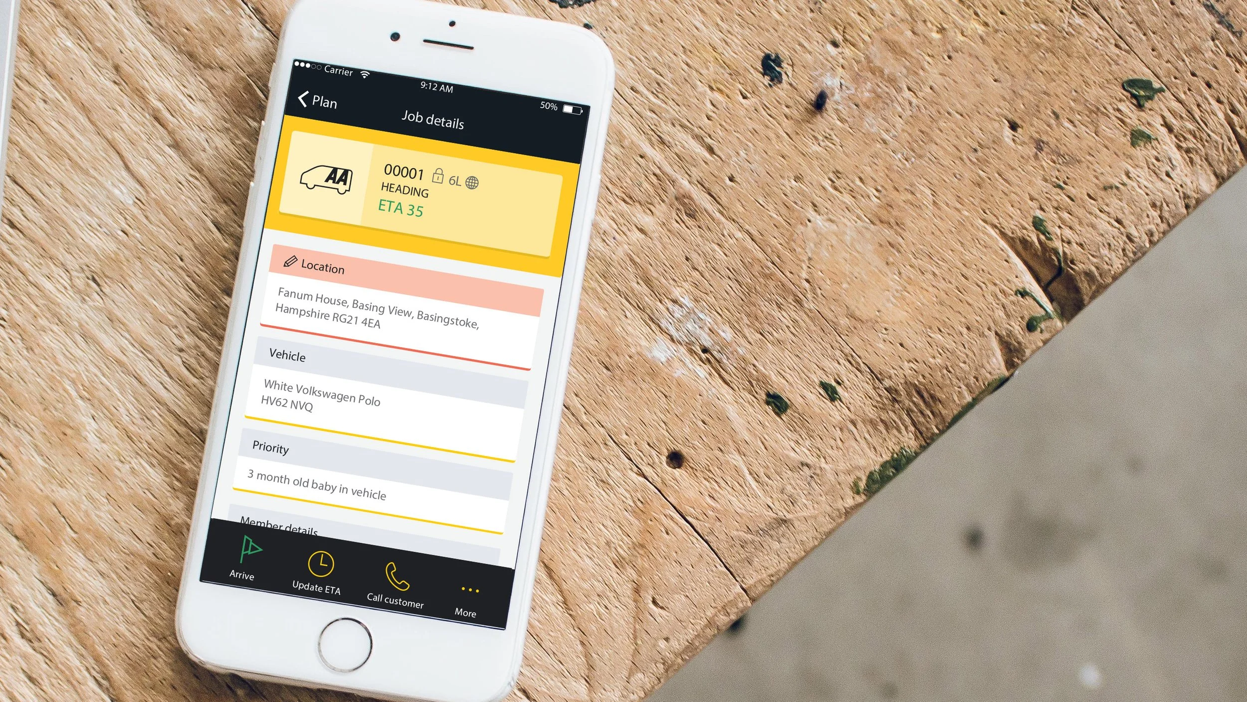
See their list of breakdown jobs for the day
Navigate quickly to each location
Understand what was wrong with the vehicle before arriving
Record the fix, capture a signature, and move to the next job
But for many, simply reading or navigating the screen was a struggle. What should have been a simple workflow became slow, stressful, and alienating
So the question became:
How might we design an app that gives patrols control, letting them personalise it, simplify it, and actually want to use it?
Discovery: Riding Along
To understand their world, I went out on the road with patrols
Standing in the rain on the side of a motorway, you quickly see what “good UX” really means. They weren’t sitting comfortably at a desk, they were gloved up, in the dark, juggling a torch and a phone while trying to stay safe
Those ride-alongs were invaluable. I learned:
Bright white screens were painful to read outdoors
Long job lists caused confusion under pressure
Some patrols preferred minimal text, others relied on icons or colour
Many wanted control over how information was presented, size, contrast, layout
The insight was simple but powerful: the app needed to adapt to them, not the other way around
My Design Journey
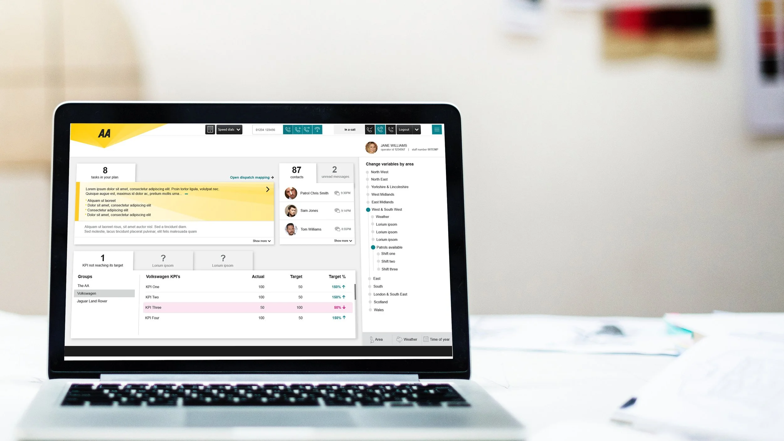
Leading a design team of 4, my process centred on accessibility, personalisation, and clarity
1. Co-designing with Patrols
I worked directly with them, sketching ideas in the vans and iterating based on what they said and how they worked. We tested layouts, colour modes, and ways to show information that didn’t rely on heavy reading.
2. Personalisation First
We introduced adjustable text sizes, high-contrast colour modes, and customisable layouts. The patrols could choose how their screen looked, from blue overlays to icon-first views.
3. Streamlining the Core Flow
I simplified the journey:
Receive a job - See key details instantly (location, issue, notes)
GPS navigation - Step-by-step directions to the breakdown
Log the fix - Quick action buttons and signature capture
Auto-transition to next job
No unnecessary screens. No cognitive overload. Just clarity and flow
The Solution
The AA Patrol App became the patrols’ daily companion, not an obligation, but a tool built for their way of working
Key Features Include:
Personalisation options: Adjustable text size, contrast, and overlay colours
Accessible UI: Clear iconography, reduced text density, and simplified navigation
End-to-end workflow: From receiving jobs to capturing fixes and signatures, all in one seamless flow
GPS integration: Turn-by-turn directions to each job
It didn’t just make the process faster, it made it feel human
The Impact
For many patrols, this was the first digital product they actually felt comfortable using
Engagement improved dramatically as adoption spread across the 3,000+ patrols
The team received direct feedback that the app “finally made sense” and felt designed for them, not at them
Fix reporting became faster, more accurate, and more consistent
Job turnaround times dropped, and so did user frustration